- PROJECT NAME
- グロサポ ロゴリニューアル
- LOGO
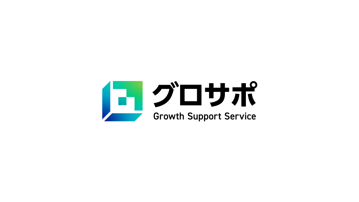
ロゴリニューアル 製造業向け成長支援サービス グロサポ
住友電設株式会社様が製造業向け成長支援サービスとして提供されている
「グロサポ」のロゴリニューアルを担当いたしました。
すでに運用されているロゴデザインのリニューアルであったため、既存のサービスイメージから離れすぎず、
かつリニューアルされた刷新感を出せるようなシンボルマークを検証。
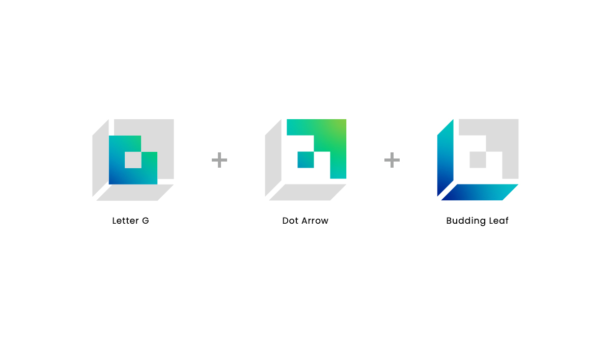
デジタル化によって進展するビジネスの象徴としての「ドット矢印」と、ビジネスの発展によって企業が成長する様を表現する「芽吹く葉」を組み合わせたシンボルマーク。全体のフォルムはサービスの頭文字であるGをベースにしています。
サービスを通じてビジネスが成長し、葉が芽吹くように新たな可能性を開く様子を表現しました。
nide.incのロゴ制作ではサービス内容やお客様のビジョンをもとに、様々な解釈からロゴ案を検討・ご提案いたします。
I was in charge of revamping the logo for "Grosapo",
a manufacturing company growth support service provided by Sumitomo Densetsu Co., Ltd.
Since this was a revamping of a logo design that was already in use, I examined logos that would not be too far removed from the existing service image, but would also give a sense of renewal and freshness.
The logo combines a "dot arrow" as a symbol of business progressing through digitalization, and a "budding leaf" to represent the way a company grows through business development. The overall form is based on the first letter of the service, G. It expresses the way a business grows through the service and opens up new possibilities like budding leaves.
When creating a logo for nide Inc., I will consider and propose logo ideas from various interpretations based on the service details and customer vision.
- CLIENT
- 住友電設株式会社
- NIDE CREDIT
- IPPEI KURIYA : Produce, Direction
TOSHIKI KOYANAGI : Design