- PROJECT NAME
- GINA
- BRANDING
- ILLUST
- WEB
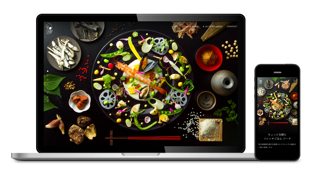
フレンチごはん 西麻布GINA
和食 × フレンチ=フレンチごはん。
このコンセプトのもとオープンしたレストラン「ジーナ」の
webサイトのリニューアル。
新しいコンセプトのお店であるが故にどういった手法で、どう表現すれば
「フレンチごはん」というものをユーザーに伝える事ができるか、
クライアントが悩んでいる状況に有り、「フレンチごはん」というものを再定義し、
ブランディングするというところから依頼され、プロジェクトが開始しました。
様々なディスカッションの結果、簡潔な言葉で綴ったブランドコピーとキービジュアルを制作し、
その二つを基軸としてwebサイトをデザインしていきました。
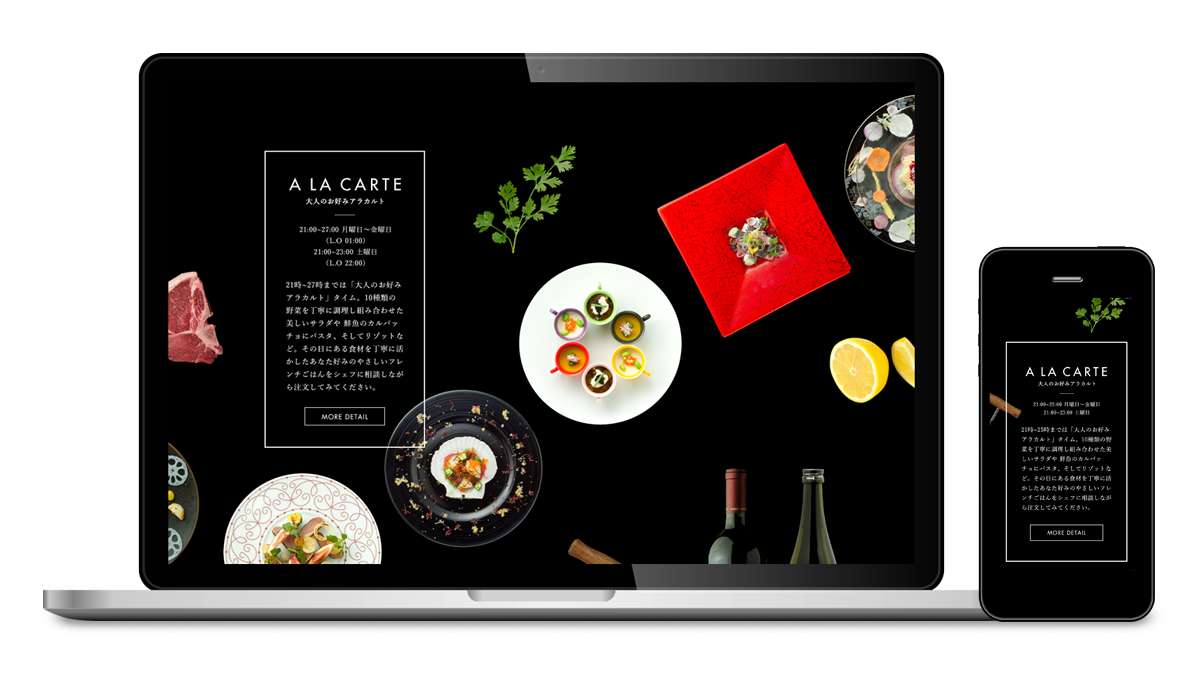
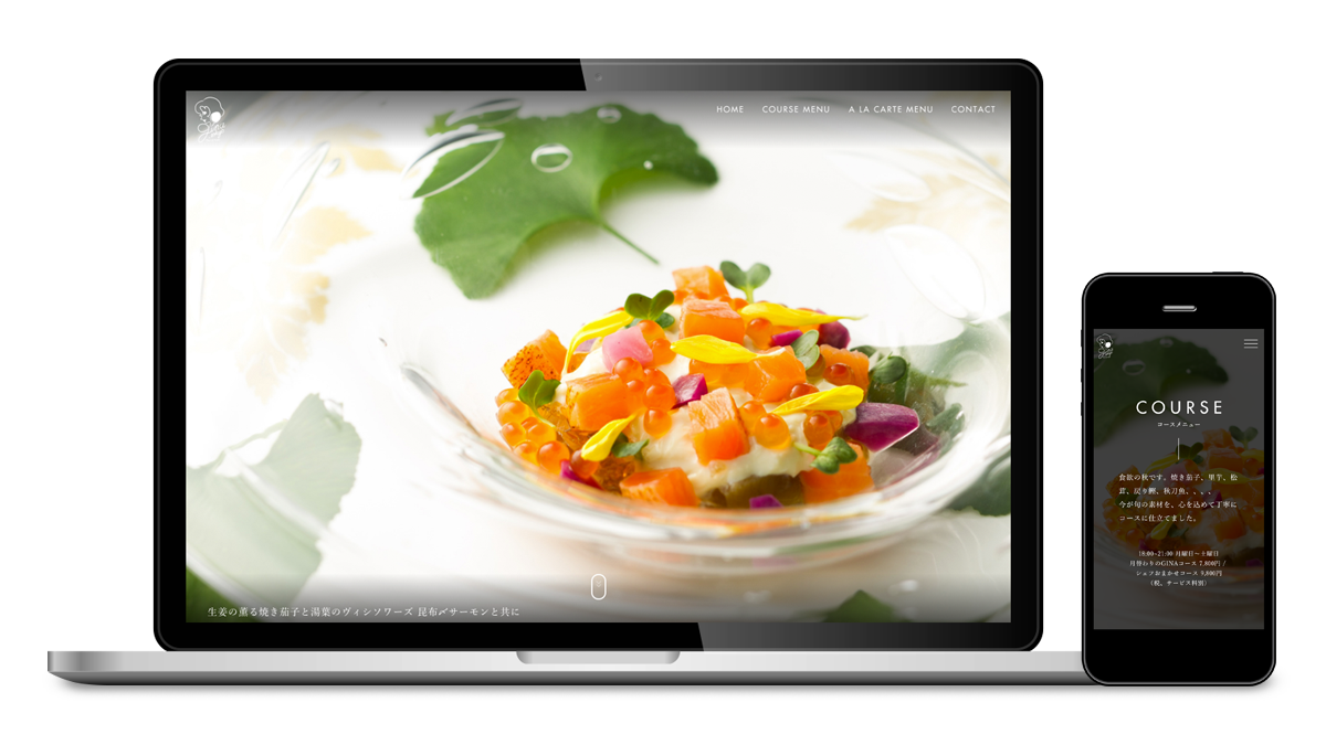
毎月変わるコースメニューのページでは、クライアント側での更新ができるよう
CMSを組み込みながらも、美しい料理のシズル感を損なわない表現に落とし込む事に成功しました。
ビジュアルや料理写真の撮影ディレクションも担当しています。
French Gohan Nishiazabu GINA
Japanese cuisine + French cuisine = French Gohan.
The redesign of the website for the restaurant, Gina, that was opened based on the above concept.
Since the restaurant was founded on a new concept, the client was in a state of uncertainty over how best to express the idea of "French Gohan" to users, and by what method. We began this project after having been commissioned to redefine and brand "French Gohan".
The result of many discussions was the creation of a brand slogan written in concise language and the key visuals, and we took both of these as the criteria by which to guide the design of the website. On the page that details the monthly changing multiple course menu we succeeded in applying a design that, even with an embedded content management system so that it can be updated on the client side, doesn't detract from the "sizzle" afforded by the images of beautiful food.
We are also in charge of the visuals and directing the food photography.
- CLIENT
- 株式会社Blue-Sky
- NIDE CREDIT
- OSAMU IIJIMA : Creative Direction, Copy Writing
REKI ITO : Produce, Direction
RYOSUKE EBISAWA : Art Direction, Design
MASAHITO ANDO : Frontend Development
RYO SATO : Frontend Development
SHUTARO MATSUHASHI : Backend Development