- PROJECT NAME
- JAPAN FOOD LAB
- BRANDING
- SIGN
JAPAN FOOD LAB
日本の「食」は安心・安全でブランド力もあります。
しかし、物は素晴らしくても知名度が低いものや
ブランディングが明確に定まっていない商品も数多くあります。
そんな中、地方の中小企業が集まり各々の商品を世に広めたいという想いから、
「本物の日本食」をコンセプトに"JAPAN FOOD LABO"が結成されました。
私たちは商品プロデュースの依頼を受け、ブランディングに携わります。
まずはプロジェクトに参加される企業一つ一つの理念をヒアリングし、
それらを新しく形にするために総合的なクリエイティブディレクションを行いました。
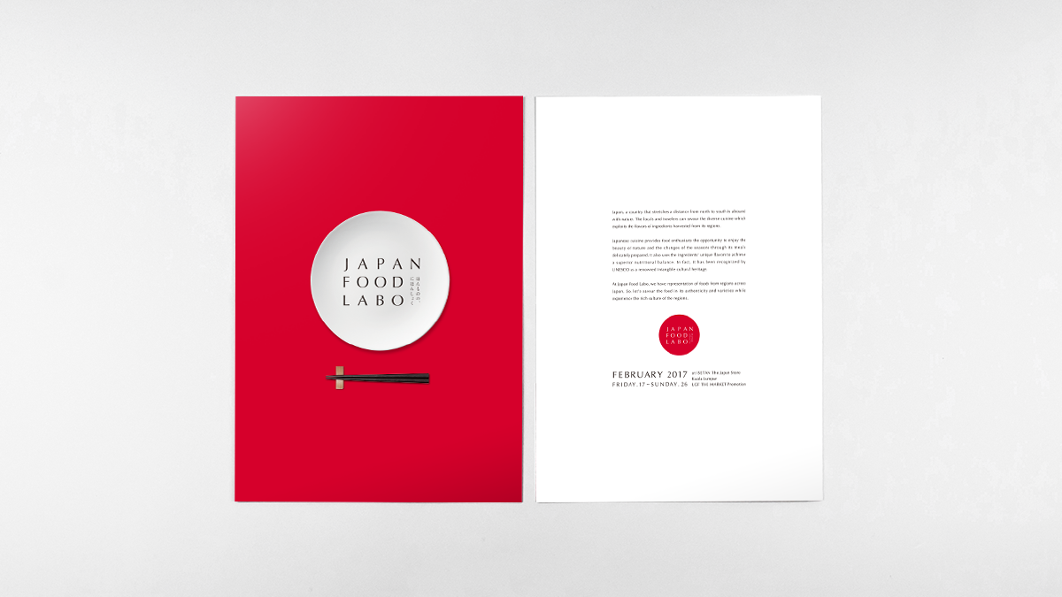
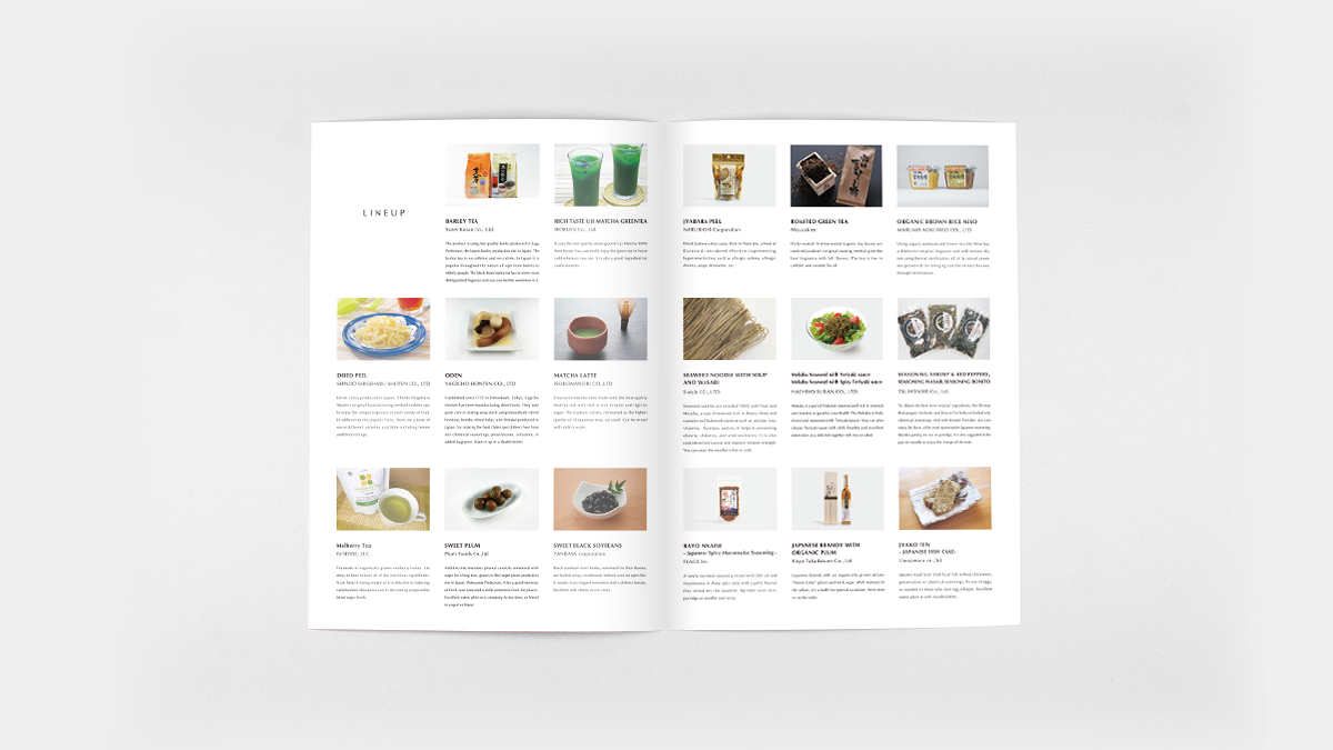
そして各社協力のもと、一新されたパッケージが完成。
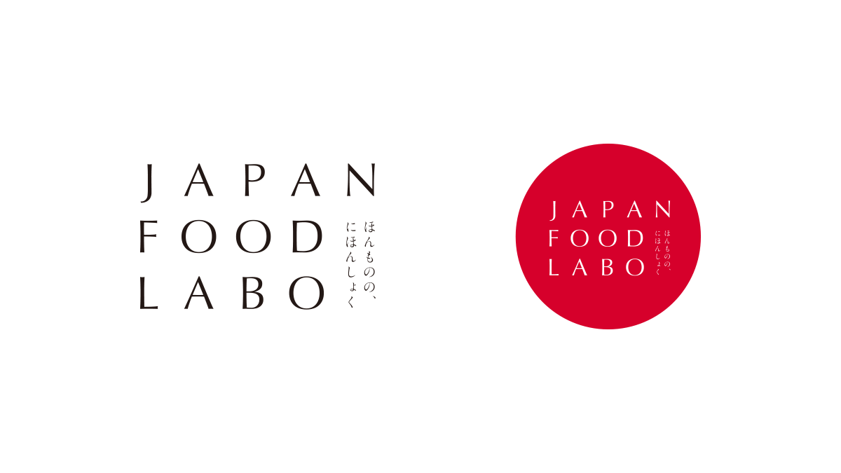
ビジュアル面ではプロジェクトロゴとグラフィック類のデザイン制作を担当しています。
海外でもジャパン・ブランドということが伝わるよう
ロゴタイプにひらがなを取り入れ、上品で和モダンな印象に。
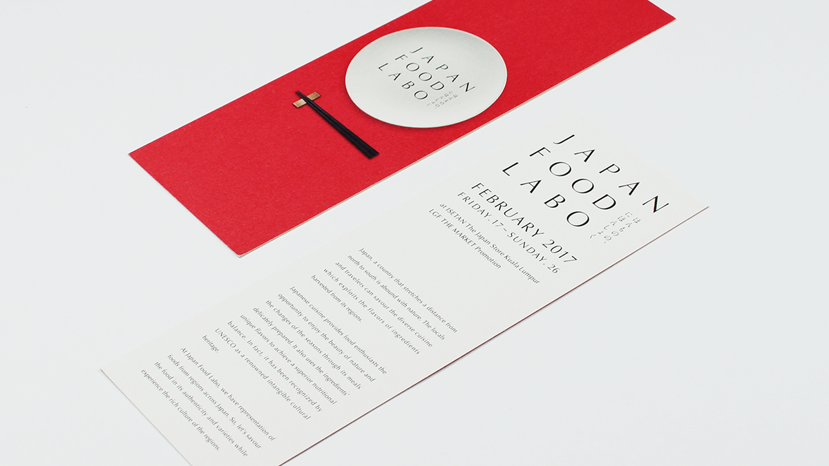
「食」をイメージさせる皿と箸をモチーフにビジュアライズし、
赤・白・黒の3色で構成された媒体は、
無駄がなく日本ならではの品や美しさ、優れた様子を象徴しています。
そして、2017年2月にマレーシアで行われたイベントでは大盛況のもと
多くの方々に新しくなった商品を手にとっていただき、
日本食への関心を引くことに成功しました。
JAPAN FOOD LAB
While Japanese food has brand power because it is considered safe and reliable, there are many wonderful products that are not very well known or that lack clearly defined branding.
In the desire to share all their products with the world, this situation motivated small and medium enterprises from regional Japan to come together and form JAPAN FOOD LABO, which takes real Japanese food as its concept.
We handle requests for product production and work with branding.
First, we got each company taking part in the project to talk to us about their philosophy. Next came comprehensive creative direction to formulate these in a new way. Then, with the cooperation of each company, we redesigned the packaging.
On the visual side, we are responsible for the project logo and the design of graphical elements.
We have incorporated Japanese hiragana characters into the logotype and created a modern Japanese image for the products in order to easily communicate the idea of "Japanese brand" internationally. This has been visualized with a plate and chopsticks motif that signifies food. The medium, which comprises the three colors of red, white, and black, serves as a concise symbol of the products, beauty, and superb look that are unique to Japan.
We successfully attracted interest in Japanese food at a jam-packed event held in Malaysia in February 2017, where these revamped products were picked up by many visitors.
- CLIENT
- LIVES Inc.
- NIDE CREDIT
- OSAMU IIJIMA :Creative Direction, Art Direction
HAYATO TANAKA : Design